Brand Identity
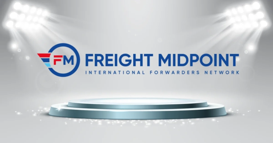
We are happy to announce of our new logo, marking an exciting milestone in the ongoing evolution of our network's brand. Over the ten years, our business has expanded and changed, and now it is time to adapt. Our logo has been changed to better represent who we are today and to represent our dynamic future. Our old logo did a really great job for our past ten years, but the time has come to move on. After careful consideration, we chose a new logo that reflects a more modern look that convey our mission and orientation for growth, while remaining true to our longstanding reputation! Our commitment to innovation, expansion, and improved members' experiences is reflected in our new logo. The logo encapsulates our core values and aligns perfectly with our vision for the future. It symbolizes our pursuit of excellence and our drive to provide the best solutions to our valued members.
Find out what is the meaning and message of our new logo:
In logo design, both shapes and letters have symbolic meanings as well as colors. The logo of "Freight Midpoint International Forwarders Network" is designed specifically to reflect the nature of our stand and perspective in the industry.
Circle: A circle is a universal symbol with extensive meaning. It represents the notions of totality, wholeness, original perfection, the self, and eternity. In the context of our network, the circle signifies unity, suggesting that our network brings different freight forwarders and logistics companies together into a cohesive, unified whole. It also suggests a global reach, symbolizing our network's ability to connect businesses around the world. Finally, circles are often seen as protective symbols - in our case, it suggests a safe, reliable, and trusted network.
Letters (FM): The interpretation of the letters is typically and directly linked to what they stand for. If "FM" is an abbreviation for the network's name, it serves as a quick, recognizable reference to the network itself. The meaning is inferred from the words these letters represent: "Freight Midpoint". However, in a more abstract sense, having the network's initials at the center of the logo (especially within the circle) suggests that whatever "FM" stands for, it's at the heart of what the network does and its core values.
Overall, the circle with the letters "FM" in the middle indicates that our network, represented by "FM", is a unified, global entity that connects different freight forwarders and logistics companies together. This gives a sense of solidarity, global unity, and reliability.
Color psychology plays a crucial role in logo design as different colors are known to evoke various emotions and can be interpreted in many ways. Here's a brief analysis of what the colors in our logo signify, particularly in the context of our network for freight forwarders and logistics companies:
Red: Red is a powerful color often associated with energy, passion, and action. In the context of our freight forwarding network, it signifies speed, efficiency, and the urgent movement of goods. This color serves to highlight the dynamic and proactive nature of your network.
Dark Blue: Dark blue is commonly associated with trust, reliability, and professionalism. These are qualities that customers would typically look for in a logistics company or freight forwarder. It signifies the network's commitment to dependable service and a strong sense of responsibility.
Light Blue: Light blue represents tranquility, understanding, and patience. In our context, it symbolizes smooth and seamless operations, hinting at the efficient and hassle-free logistics solutions provided by our network's members. It also symbolizes open communication and cooperation among the network members.
It's essential to note that cultural context influences the interpretation of color, and these are broad interpretations based on general color psychology principles. However, the combination of these three colors in our logo suggest a balance between energetic action (red), reliable service (dark blue), and smooth, cooperative operations (light blue).
New Sleek Design for Our Corporate Website
Along with announcing our new brand logo, we have revamped our website too. The new site comes in a modern, clean, and organized layout to provide members to find information and resources quickly and easily. The new design will also enhance our online community where we can learn, grow, and connect together. The new website and logo won't change anything about the network's operations or nature, and it won't have any impact whatsoever on our current relationships with our partners and members.
Stay Tuned! The new website and logo are planned to be officially launched on 18 July 2023 - Tuesday. We invite you to join us in celebrating this milestone. Please like, comment, and share your thoughts on our new logo. Your feedback is invaluable, and we appreciate your engagement as we embrace this exciting change together.